Sunday, October 28, 2012

Ernst Wilhelm Nay @ Michael Werner Gallery

Menschenlicht, 1965


Gelb zwischen zwei Zeiten, 1965

Verschlossene Gedanken, 1965
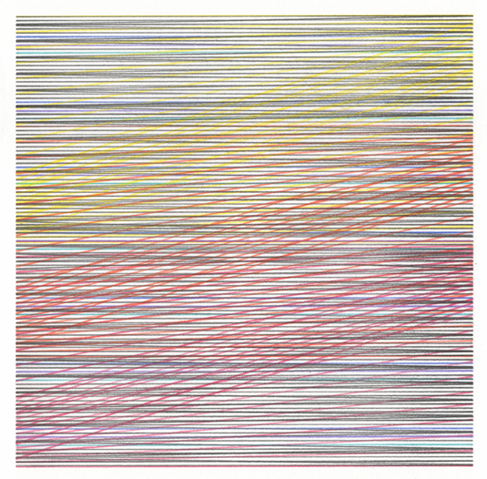

Rot in Rot II, 1965


"Life is a compromise, art never is."
-Ernst Wilhelm Nay


Rot in Rot I, 1965


Press Release:

Michael Werner and Mary Boone Galleries are pleased to announce their collaborative exhibition surveying the work of German artist Ernst Wilhelm Nay (1902-1968). The most important German painter during the first half of the twentieth century, Nay is all but unknown outside of Europe today. Presented simultaneously in three Manhattan galleries, this special exhibition is the first significant presentation of Nay’s work in the United States since his death and offers a rare opportunity to consider the work of this unique artist. 

The exhibitions at Michael Werner and Mary Boone Galleries focus on Nay’s works of the 1950s and 1960s – the period when Nay fully embraced color and abstraction in his work. The trajectory of his development follows a gradual and deliberate transformation from expressive realism to total abstraction and it is the works of his late period that represent the pinnacle of Nay’s artistic achievement. Nay’s earliest works were derived from the then-prevalent Expressionist style; Ernst Ludwig Kirchner was an important early source for the young Nay. However, where Kirchner ends, Nay begins, and therein lies the importance of Nay’s achievement. Whereas many of Nay’s peers turned away from Expressionism, eventually embracing the models of tachisme and Art Informel, Nay formed his own way by extending the pre-War language and style of Expressionism into a modern pictorial language of abstraction. 

Nay’s first breakthrough occurred in 1937 with the “Fischer- und Lofotenbilder”, two discreet series of pictures devoted to fishermen and the landscape of Norway’s Lofoten Islands. These paintings synthesize Nay’s early works with a newfound interest in the expressive potential of color. The “Lofoten Paintings” are also Nay’s first attempt to explore a motif serially. The importance of color and the organizational concept of the series are two characteristics that became central in the development of Nay’s art from this point forward. A series of paintings and drawings in the 1950s mark the artist’s second major breakthrough. Inspired by notions of synesthesia – specifically, the relationship of musical sounds and rhythms with colors and forms – Nay began to approach color as form, divorced from drawing. These so-called “Rhythmic Paintings” (“Rhythmischen Bildern”) brought Nay definitively into the realm of abstraction. Nay continued his investigation of color as form in a series of works characterized by subtly modulated, circular color planes covering large areas of the picture surface. These developed further into the “Eye Paintings (“Augenbilder”) of 1963 and 1964, so named for their suggestive ocular forms emerging from the picture plane. These paintings led to Nay’s third breakthrough. The paintings of 1965 underwent a rigorous simplification of form and palette which would come to define the works of the following years. Often limited to only a few clear, intense colors, typically spread over large areas of the canvas, these works are the culmination of Nay’s decades of experimentation in painting. At a time when most artists were in the grip of second-generation variations on Abstract Expressionism, or enthralled with the newly emerging trends of Pop, Op and Minimalism, Nay developed a unique style that imbued abstract pictorial content with the capacity for deep conceptual and expressive meaning. 

Ernst Wilhelm Nay was born in Berlin in 1902. He developed an interest in art at a young age and taught himself drawing and painting. Nay was admitted to the Berlin Art Academy in 1925 on the merits of his first, self-taught paintings, and quickly became the master student of Expressionist painter Carl Hofer. Nay’s early talents proved very promising. In 1927, while still an Academy student, the Provinzial Museum, Hannover, became the first museum to acquire the artist’s works (Nationalgalerie Berlin would acquire two paintings a few short years later). On leaving the Academy in 1928 Nay began exhibiting his work throughout Germany. He traveled abroad, first to Paris and then, on receiving the Prix de Rome in 1931, to Italy. However, these early successes were short lived. Like many avant-garde artists of the time, Nay’s work ran counter to the ideals set forth by the National Socialists: they attacked Nay’s paintings as “masterpieces of ugliness”, confiscated his works from state museums and ultimately included Nay in their infamous exhibition Degenerate Art in 1937. Left with no opportunities to exhibit his work, nor even the means to acquire basic materials, Nay briefly left Germany, traveling and painting in Norway thanks to the generosity of Edvard Munch. Beginning in 1940 Nay served in the army as a cartographer and traveled in Southern France, Brittany and Le Mans. Bombing destroyed his studio in Berlin in 1943. Remarkably, Nay continued to paint and draw in his spare time during military service, and in 1943 he arranged for an exhibition of his wartime works on paper at Galerie Günther Franke in Munich; a short time later he traveled to Paris on a duty trip, where he befriended Kandinsky and other artists of the Parisian avant-garde. 

Released from the army in 1945, Nay ambitiously resumed his practice and continued to exhibit his work with ever greater commercial and critical success. Nay first participated in the Venice Biennale in 1948 – he would represent Germany there in 1956 – and in 1950 Kestner Gesellschaft Hannover organized the artist’s first retrospective exhibition. His first solo exhibition in America took place in 1955 at Kleemann Galleries in New York City. That same year Nay participated in the first Documenta; he would exhibit there again in 1959 and 1964. Beginning in the 1950s his works were included in every major survey exhibition of contemporary German art. From the 1960s onwards his work started to be shown extensively outside of Europe. He continued to exhibit his works internationally until his death in Cologne in 1968. Works by Nay are found in museums throughout Europe, including Kunstmuseum Bonn; Nationalgalerie Berlin; Wilhelm Lehmbruck-Museum, Duisburg; Museum Ludwig, Köln; Staatsgalerie Stuttgart; Kunstmuseum Basel; Tate Modern, London; Musées royaux des Beaux-Arts, Brussels; Solomon R. Guggenheim Museum, New York; Albright-Knox Art Gallery, Buffalo; Busch-Reisinger Museum, Cambridge; The Saint Louis Art Museum; and The Wadsworth Atheneum, Hartford, among many others. 


Spindeln in Grau, 1965


*A fully illustrated catalog is available with an essay by David Rhodes.


Detail of Rot in Rot II, 1965

Grau und Weiß, 1965

Blau diaphan, 1965

Detail from Gelb zwischen zwei Zeiten, 1965

Detail from Grau und Weiß, 1965

Detail from Blau diaphan, 1965

Detail from Menschenlicht, 1965


Ocker - Dunkelblau, 1966

Dunkel und Weiß, 1968


Ernst Wilhelm Nay: Paintings
September 7 - October 27, 2012
4 East 77th Street
New York, NY 10075

Tuesday, October 23, 2012

Rob de Oude @ Galerie Gourvennec Ogor

Double Cross, 2012, colored pencil on paper, 8 x 8 in.

Mi O Minus, 2012, oil on panel, 14 x 14 in.

Mono Para, 2012, oil on panel, 14 x 14 in.


Orange Realigned, 2012, oil on panel, 16 x 16 in.


From the press release:

Rob de Oude makes straight lines bend. He achieves this perceptual effect through a rigorous and meticulous painting process, layering and weaving matrices of straight lines until, between the contrasting colors and crisscrossing patterns, grids begin to bow and warp. This visual slight, a more painterly and maximalist type of Op art, tricks the eye through sheer ocular overload. In an age of unabated visional stimulation, these super-imposed networks speak of digital delirium, increased connectivity between disparate points and, perhaps most crucially, unbridled visual pleasure.

Much like a web — whether of fiber-optic cables or spider-spun silk — de Oude’s compositions have a seductive power that’s difficult to escape. Indeed, each piece reveals more of itself the longer viewers’ eyes remain caught in its patterns. The many precise and overlapping threads begin to separate and become distinct, previously unnoticed hues emerge, and the compositions seem to shape-shift and spin as viewers parse the works’ optical static. The latticework of lineaments slowly reveals its inner logic.

De Oude’s paintings demand contemplative and close engagement beyond their immediately gripping visual tricks. Looking at a piece can induce a trance-like immersion not unlike his painting process. A surprisingly simple rig with clamps and ruled edges allows for an infinite variety of fine lines applied in dozens of layers over a base of airbrushed neon clouds. By juxtaposing contrasting hues, he builds up a complex mesh whose individual strands can only be teased out on close inspection.

For his exhibition at Galerie Gourvennec Ogor, de Oude will be showcasing four series of works, two of which are recent developments in his practice and feature the tilted perspectives that give the show its title. In addition to sets of large canvases and wall pieces, he has begun experimenting with rotated canvases for his newest and brightest medium-sized paintings. Full of competing shapes and shifting colors, these canted works throw the composition further off balance, suggesting new potential horizons. And in sharp contrast to recent pieces dominated by Day-Glo blues, lime greens and radioactive yellows, de Oude has pared down his palette to create his first series of monochrome paintings. Without the complex interplay of colors, these works focus attention on line and geometry in a manner that evokes the likes of Bridget Riley or Victor Vasarely.

In all four series featured here, however, de Oude demonstrates his prodigious talent for turning rigid grids into enveloping nets. What he calls attention to, above all else, is how willingly our eyes can be seduced from linear ways of thinking and looking into swirling patterns of color and webs of lines designed to ensnare vision. As we let ourselves become lost in the grids, like optical flâneurs wandering a boundless maze, previously invisible images shift into focus.

Rob de Oude was born in the Netherlands and studied at Amsterdam’s Hoge School voor de Kunsten and SUNY Purchase in New York. He currently lives in Brooklyn and has his studio in Queens, where he is also the co-director of the gallery Parallel Art Space.


Pinking Squared, 2012, oil on panel, 16 x 16 in.

Repeated Roundabout (Orange Blush), oil and acrylic on panel, 16 x 16 in.

Slow Fade, 2012, color pencil on paper, 8 x 8 in.

Black Band Resonance, 2012, color pencil on paper, 8 x 8 in.

Quadrant, 2012, color pencil on paper, 8 x 8 in.

Tangibly Paradoxed, 2012, oil and acrylic on panel, 16 x 16 in.


Rob de Oude: TILT
November 15, 2012 - January 5, 2013
7 rue Duverger 13002 Marseille, France
tel. : + 33 (0)9 81 45 23 80


Friday, October 19, 2012

Felrath Hines (1913 - 1993) - Balancing Color


Stop Go - Go Stop, oil on linen, other information unavailable

Untitled (Grey and Ochre), 1977, oil on linen 72 x 54 in.

It's About Time, 1991, oil on linen 64 x 44 in.

Felrath Hines


Working primarily in an abstract manner from the mid-1950s forward, Hines created a body of work of extraordinary quality and originality. His abstractions synthesized a keen sensibility of an accomplished draughtsman with the poetry and inventive structure that linked his work to the American abstract tradition of Stuart Davis, Al Held, Barnett Newman and Mark Rothko.
Hines did not see abstract art as too personal, or too introspective, or too esoteric.  For him making art, crafting compositions that had the characteristics of complex 20th century modernist works occupied him totally.  He was committed to painting as a professional occupation.
From the mid-1950s forward, Hines produced a large body of abstract work.   Paintings such as Church (1950) show that his creativity was not limited by mimetic concerns.  Here he privileged an analytical-interpretative vision of the church, transforming the image of it into something that spoke more to the mind than to the eye.
In pieces like Midnight Garden (1991), it is clear that Hines had achieved a mastery of composition, color, space, and design.  The many times I visited Hines’s studio I never got tired of looking and re-looking at this work. I always felt that I was missing something, although I had carefully scrutinized this painting.  It is a construction of visual elegance that has a compelling narrative that never quite tells the end of the story.
In so many of his works, Hines takes what  appears to be  simple objects or subjects and produces works that speak to us in many ways.  They raise epistemological and axiological issues that reveal Hines’s strong intellectual interests as an artist.  For instance, in Image (1958) Hines brings us into the central part of the picture then presents equivocal shapes that suggest both proximate and distant space.  He uses a light, warm, neutral color to define the delimitations of the top and right sides of the painting.  He uses binary framing devices and also ambiguities with respect to the spatial definitions that are unique to him at this time in his career.
- Taken from a short bio, written by Floyd Coleman, on the David C. Driskell Center website.
  Read more here


Trellis, 1986, oil on linen, 72 x 60 in.

Red Stripe with Green Background, 1986, oil on linen, 51 x 39 7/8 in.

Party's Over, 1992, oil on linen, dimensions unavailable

Piano Forte, 1988, oil on linen, dimensions unavailable

Radiant, oil on linen, other information unavailable

Untitled, early 1970's, oil on canvas, 42 x 48 in.

Escape, 1989, oil on linen, 58 5/8 x 52 9/16 in.

Four Square, 1982, oil on linen, 66 x 69 in.

Keylike, 1984, oil on linen, 50 x 56 in.

Untitled #1, 1974, oil on linen, dimensions unavailable


*All images of work © The Estate of Felrath Hines
**The photographer of the portrait of Hines could not be identified.

Wednesday, October 17, 2012

Henri Michaux: With Mescaline And On White

Henri Michaux, 1961, Untitled (detail), chinese ink drawing on paper

And

white

appears. Absolute

white.

White

beyond all

whiteness.

White

of the coming of the

White.

White

without compromise, through exclusion, through total eradication of

non-white.

Insane, enraged

white,

screaming with

whiteness.

Fanatical, furious, riddling the retina. Horrible electric

white,

implacable, murderous.

White

in bursts of 

white.


-Henri Michaux, "With Mescaline", 1956

Monday, October 15, 2012

Closing Brunch For Heroes Curated By Julie Torres @ Small Black Door

Installation view of work by Chris Harding

Installation view of works by James Prez

 Drawings by Brett Baker

Paul D'Agostino

Participating artist James Prez with Kerry Law and Katey Chapman


Sunday, October 14, curator, Julie Torres hosted a closing brunch for participating artists and visitors on the final day of the group exhibition Heroes.
The show was held at Small Black Door in Ridgewood, Queens and featured work by: Liz Atzberger, John Avelutto, Brett Baker, Paul Behnke, Deborah Brown, Sharon Butler, Kevin Curran, Joy Curtis, Paul D'Agostino, Rob de Oude, Lacey Fekishazy, Enrico Gomez, Chris Harding, Katarina Hybenova, Lars Kremer, Ellen Letcher, Amy Lincoln, Loren Munk, Matthew Mahler, Mike Olin, James Prez, Kevin Regan, Jonathan Terranova, and Austin Thomas.

For an informative walk through of the exhibition check out the video at James Kalm Report's Rough Cut here.


Kate Wadkins discuses the work on view with participating artist Enrico Gomez 


Installation view with abstractions by Enrico Gomez along with map pieces by Lars Kremer

Amy Lincoln

Work by Sharon Butler

Lacey Fekishazy

Kevin Curran

Loren Munk

Amanda Lynch (featured in the video piece Blessa by Hybenova) with participating artists Matthew Mahler and Katarina Hybenova

Lacey Fekishazy

Work by Deborah Brown

 Matthew Mahler

Curator (and Hero in her own right) Julie Torres greets participating artists Rob de Oude, Mike Olin and Joy Curtis